View Prototype


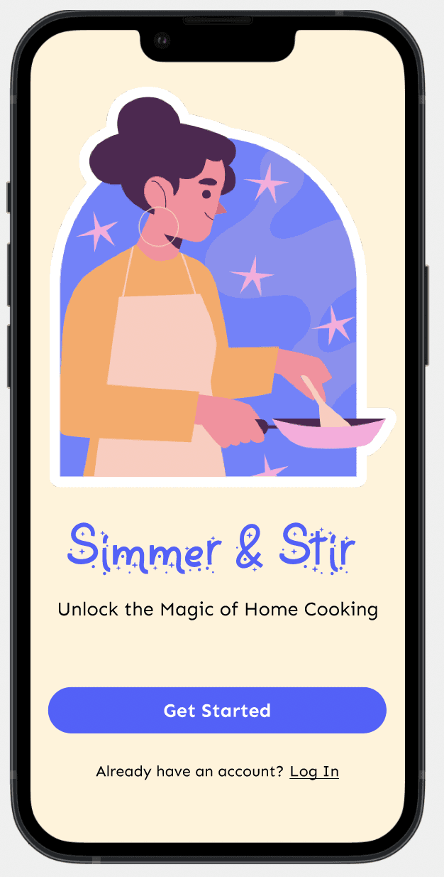
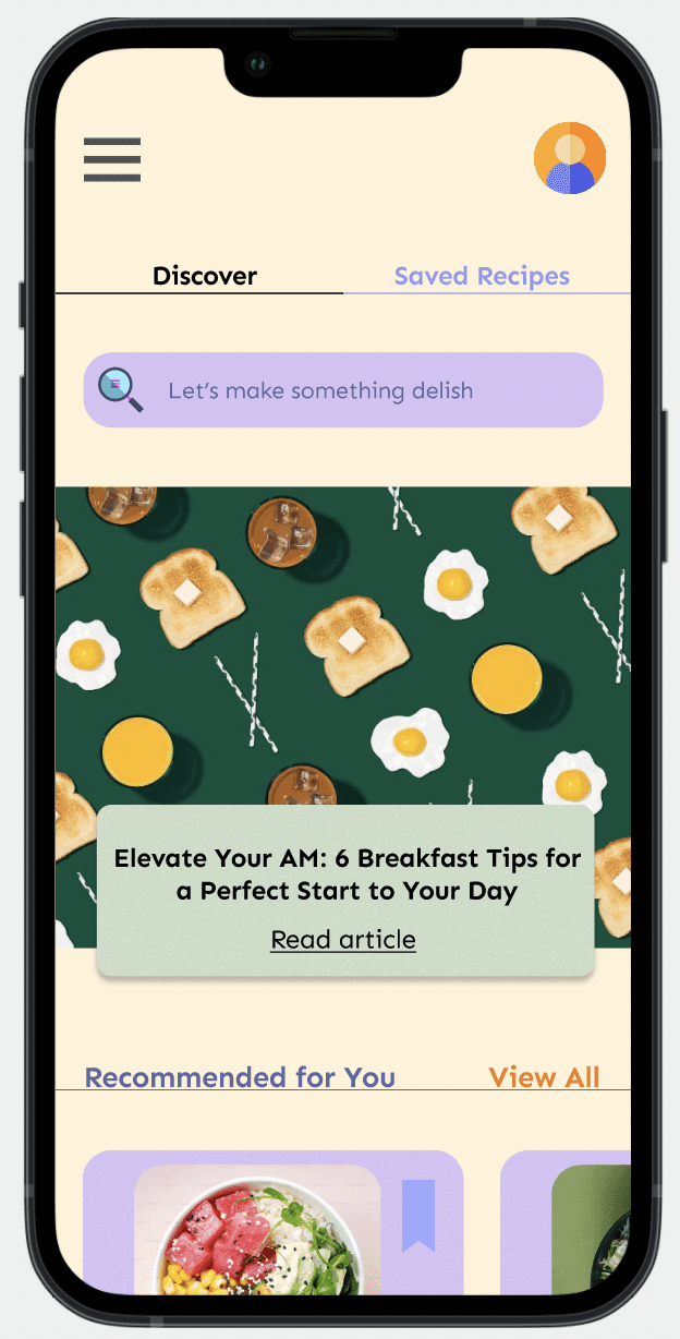
A mobile website that seamlessly blends gamified learning with recipe discovery, creating an all-in-one experience for home cooks.
A mobile website that seamlessly blends gamified learning with recipe discovery, creating an all-in-one experience for home cooks.
A mobile website that seamlessly blends gamified learning with recipe discovery, creating an all-in-one experience for home cooks.
View Prototype
View Prototype
Timeline
Timeline
Timeline
May 2024 - July 2024
May 2024 - July 2024
May 2024 - July 2024
Role
Role
Role
UX Research, UX/UI Design, Logo Design
UX Research, UX/UI Design, Logo Design
UX Research, UX/UI Design, Logo Design
Tools
Tools
Tools
Figma, Optimal Workshop, Maze, paper
Figma, Optimal Workshop, Maze, paper






CONTEXT
Overview
In 2020, like many during lockdown, I discovered a passion for cooking. Social media has made cooking more accessible to those without formal training or family teaching. The rise of "chefluencers" and recipe creators shows the growing interest in cooking content.
Despite exploring cookbooks, IG reels, TikToks, YouTube, and meal kits, I found the learning process frustrating. Existing resources often lacked detailed explanations and didn’t delve into the science behind cooking.
This inspired me to create a tool for young adults in urban settings—tech-savvy individuals who value both convenience and education. My tool not only provides recipes but also teaches foundational techniques, helping users understand the art and science of cooking and feel confident in the kitchen.
The Challenge
Design an MVP mobile website that simplifies learning essential cooking skills while directly addressing users' needs in addition to frustrations and gaps in current resources.
Research
When I began this project, my goal was to gauge whether people would be interested in the concept at all. I started with research to explore existing cooking apps and to understand what drives people to cook, how it fits into their daily routines, how they've learned the skill, and the common challenges they encounter.
CONTEXT
Overview
Overview
In 2020, like many during lockdown, I discovered a passion for cooking. Social media has made cooking more accessible to those without formal training or family teaching. The rise of "chefluencers" and recipe creators shows the growing interest in cooking content.
Despite exploring cookbooks, IG reels, TikToks, YouTube, and meal kits, I found the learning process frustrating. Existing resources often lacked detailed explanations and didn’t delve into the science behind cooking.
This inspired me to create a tool for young adults in urban settings—tech-savvy individuals who value both convenience and education. My tool not only provides recipes but also teaches foundational techniques, helping users understand the art and science of cooking and feel confident in the kitchen.
The Challenge
The Challenge
Design an MVP mobile website that simplifies learning essential cooking skills while directly addressing users' needs in addition to frustrations and gaps in current resources.
Design an MVP mobile website that simplifies learning essential cooking skills while directly addressing users' needs in addition to frustrations and gaps in current resources.
Research
Research
When I began this project, my goal was to gauge whether people would be interested in the concept at all. I started with research to explore existing cooking apps and to understand what drives people to cook, how it fits into their daily routines, how they've learned the skill, and the common challenges they encounter.
When I began this project, my goal was to gauge whether people would be interested in the concept at all. I started with research to explore existing cooking apps and to understand what drives people to cook, how it fits into their daily routines, how they've learned the skill, and the common challenges they encounter.
As I explored the reasons people want to cook, I realized the motivation is there—so what's holding them back?
As I explored the reasons people want to cook, I realized the motivation is there—so what's holding them back?
As I explored the reasons people want to cook, I realized the motivation is there—so what's holding them back?

Community/connection
Community/connection

Saving money
Saving money

Culinary exploration
Culinary exploration

Skill development
Skill development

Health consciousness
& dietary preferences
Health consciousness
& dietary preferences
INTERVIEWS
INTERVIEWS



User Interviews
User Interviews
User Interviews
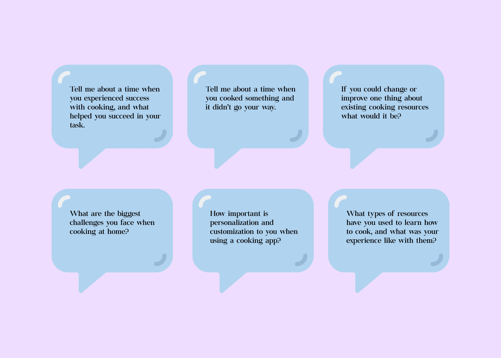
I interviewed six users aged 23-32, all living in or near major cities and actively using online resources for cooking. Through these interviews, I gathered a range of insights on their successes, failures, desired features, interface suggestions, and motivations. Their stories and feedback were guided by open-ended questions that significantly influenced my design process. User interviews proved to be an ideal research method, allowing me to uncover valuable patterns and insights from their detailed anecdotes and experiences.
I interviewed six users aged 23-32, all living in or near major cities and actively using online resources for cooking. Through these interviews, I gathered a range of insights on their successes, failures, desired features, interface suggestions, and motivations. Their stories and feedback were guided by open-ended questions that significantly influenced my design process. User interviews proved to be an ideal research method, allowing me to uncover valuable patterns and insights from their detailed anecdotes and experiences.
I interviewed six users aged 23-32, all living in or near major cities and actively using online resources for cooking. Through these interviews, I gathered a range of insights on their successes, failures, desired features, interface suggestions, and motivations. Their stories and feedback were guided by open-ended questions that significantly influenced my design process. User interviews proved to be an ideal research method, allowing me to uncover valuable patterns and insights from their detailed anecdotes and experiences.
COMPETITIVE ANALYSIS
COMPETITIVE ANALYSIS


Kitchen Stories



Epicurious


Tasty


Competitors
Competitors
Competitors
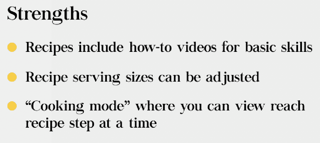
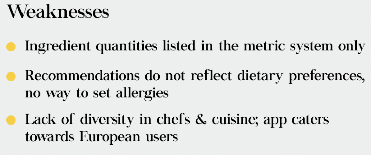
People use Kitchen Stories, Epicurious, and Tasty for their cooking needs. Although these apps have similar layouts, they offer different features. To understand user preferences, I analyzed the strengths and weaknesses of each app.
People use Kitchen Stories, Epicurious, and Tasty for their cooking needs. Although these apps have similar layouts, they offer different features. To understand user preferences, I analyzed the strengths and weaknesses of each app.
People use Kitchen Stories, Epicurious, and Tasty for their cooking needs. Although these apps have similar layouts, they offer different features. To understand user preferences, I analyzed the strengths and weaknesses of each app.


Saving money


Culinary exploration


Skill development


Health consciousness
& dietary preferences
Comprehensive Feature Analysis
Comprehensive Feature Analysis
Comprehensive Feature Analysis
RESEARCH INSIGHTS
RESEARCH INSIGHTS
I started my research with assumptions about cooking habits and resources, many of which were validated. I also uncovered new problem areas through valuable insights from my interviewees.
I started my research with assumptions about cooking habits and resources, many of which were validated. I also uncovered new problem areas through valuable insights from my interviewees.


User Insights


User Insights
User Insights
Research and affinity mapping uncovered several key insights: Beginner cooks struggle to find skill-appropriate resources and feel intimidated, leading to a lack of confidence. Users commonly face challenges with ingredient substitutions and express frustration over inconsistent quality and accuracy in recipes. They want a single platform for all cooking needs, with customization and personalization, especially for food sensitivities and preferences. Gaps in cooking knowledge often result in failures that further discourage those with low motivation to cook.
Research and affinity mapping uncovered several key insights: Beginner cooks struggle to find skill-appropriate resources and feel intimidated, leading to a lack of confidence. Users commonly face challenges with ingredient substitutions and express frustration over inconsistent quality and accuracy in recipes. They want a single platform for all cooking needs, with customization and personalization, especially for food sensitivities and preferences. Gaps in cooking knowledge often result in failures that further discourage those with low motivation to cook.
Research and affinity mapping uncovered several key insights: Beginner cooks struggle to find skill-appropriate resources and feel intimidated, leading to a lack of confidence. Users commonly face challenges with ingredient substitutions and express frustration over inconsistent quality and accuracy in recipes. They want a single platform for all cooking needs, with customization and personalization, especially for food sensitivities and preferences. Gaps in cooking knowledge often result in failures that further discourage those with low motivation to cook.
My interviewees primarily use social media and online blogs for cooking inspiration. With more time, I would have liked to hear from users experienced with cooking apps like Yummly or NYT Cooking.
My interviewees primarily use social media and online blogs for cooking inspiration. With more time, I would have liked to hear from users experienced with cooking apps like Yummly or NYT Cooking.
My interviewees primarily use social media and online blogs for cooking inspiration. With more time, I would have liked to hear from users experienced with cooking apps like Yummly or NYT Cooking.
USER PERSONAS

USER PERSONAS


The Users


The Users
The Users
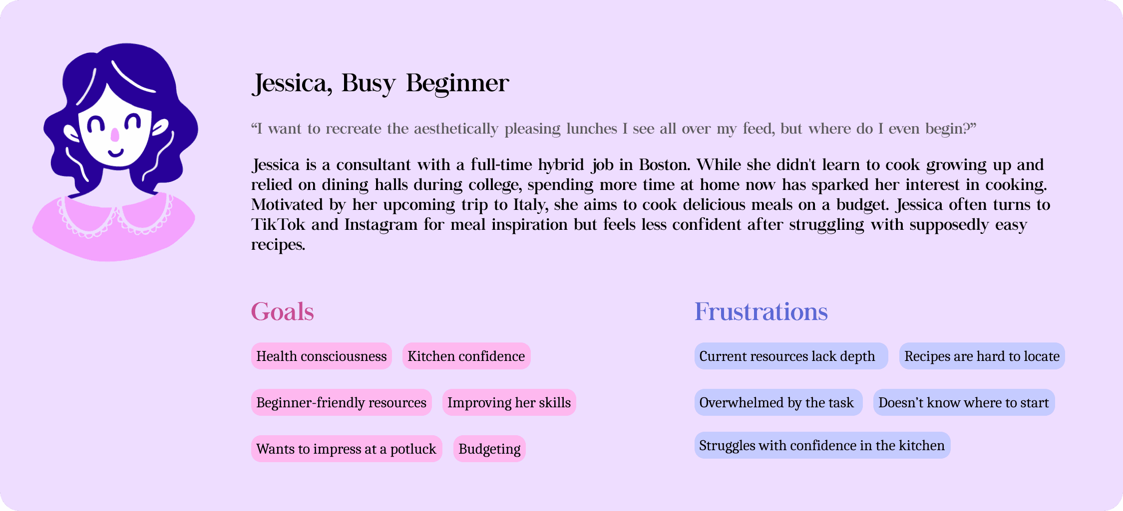
I created two personas from my interviews and research. The first is Jessica, a busy urban professional who seeks cooking inspiration from social media and cooks primarily for budgeting. The second is Liz, an intermediate cook who struggles with motivation and wants to simplify the process while accommodating her special diet needs.
Figuring out what to build
Recognizing that educational cooking content is what will differentiate my product from its competitors, I needed to define its purpose and objectives. To do this, I focused on identifying a primary problem to solve. Based on my main persona's story, I developed the following problem statement:
Jessica is a beginner cook seeking a straightforward, all-in-one platform where she can easily access recipes and learn cooking skills.
This is an opportunity to explore the successes of various educational apps and create a seamless experience that meets all user expectations for a cooking platform.
GOALS & FEATURES
GOALS & FEATURES
How can I create a trustworthy solution that combines educational cooking content with a unified platform for recipes, while finding its place in the market?
How can I create a trustworthy solution that combines educational cooking content with a unified platform for recipes, while finding its place in the market?
How can I create a trustworthy solution that combines educational cooking content with a unified platform for recipes, while finding its place in the market?

Market Differentiation: I identified gaps in existing apps while retaining key features that users may expect like a grocery list, focusing on a unified platform that simplifies essential skills with gamified learning and a visually engaging, magical theme.
Market Differentiation: I identified gaps in existing apps while retaining key features that users may expect like a grocery list, focusing on a unified platform that simplifies essential skills with gamified learning and a visually engaging, magical theme.
Market Differentiation: I identified gaps in existing apps while retaining key features that users may expect like a grocery list, focusing on a unified platform that simplifies essential skills with gamified learning and a visually engaging, magical theme.

User Motivation & Pain Points: I examined what drives people to cook and the challenges they face, aiming to make learning more accessible and less overwhelming.
User Motivation & Pain Points: I examined what drives people to cook and the challenges they face, aiming to make learning more accessible and less overwhelming.
User Motivation & Pain Points: I examined what drives people to cook and the challenges they face, aiming to make learning more accessible and less overwhelming.

Learning Experience: I prioritized creating an interface that makes cooking education approachable and fun, combining bite-sized lessons, interactive content, and game-like elements to maintain engagement and build users' confidence.
Learning Experience: I prioritized creating an interface that makes cooking education approachable and fun, combining bite-sized lessons, interactive content, and game-like elements to maintain engagement and build users' confidence.
Learning Experience: I prioritized creating an interface that makes cooking education approachable and fun, combining bite-sized lessons, interactive content, and game-like elements to maintain engagement and build users' confidence.

Usability & Accessibility: The app’s design needed to be intuitive, ensuring users of all skill levels could navigate it easily and focus on learning.
Usability & Accessibility: The app’s design needed to be intuitive, ensuring users of all skill levels could navigate it easily and focus on learning.
Usability & Accessibility: The app’s design needed to be intuitive, ensuring users of all skill levels could navigate it easily and focus on learning.

Freemium Model: Offering a strong value proposition through a freemium model was crucial. I needed to clearly differentiate between free and premium features, ensuring users see the value in upgrading.
Freemium Model: Offering a strong value proposition through a freemium model was crucial. I needed to clearly differentiate between free and premium features, ensuring users see the value in upgrading.
Freemium Model: Offering a strong value proposition through a freemium model was crucial. I needed to clearly differentiate between free and premium features, ensuring users see the value in upgrading.

Long-Term Engagement: I included features like personalized recipe suggestions based on completed lessons to keep users engaged over time.
Long-Term Engagement: I included features like personalized recipe suggestions based on completed lessons to keep users engaged over time.
Long-Term Engagement: I included features like personalized recipe suggestions based on completed lessons to keep users engaged over time.
Business & User Needs
To identify the most beneficial features, I developed a value proposition that addressed user needs and frustrations while aligning with business goals.
Gamified learning was chosen for Simmer & Stir to boost engagement and enjoyment. By incorporating elements like challenges, rewards, and progress tracking, users remain motivated and committed to improving their cooking skills. This approach makes learning fun, aids retention, and turns cooking lessons into achievable goals with immediate feedback and a sense of accomplishment.
My goal is to help users feel confident and excited about cooking, transforming it from a daily chore into a source of exploration. With the growing trend of using apps and social media to learn new skills, there is significant market potential for a product that aligns with current trends and offers a meaningful sense of achievement and self-care.
Business & User Needs
Business & User Needs
To identify the most beneficial features, I developed a value proposition that addressed user needs and frustrations while aligning with business goals.
Gamified learning was chosen for Simmer & Stir to boost engagement and enjoyment. By incorporating elements like challenges, rewards, and progress tracking, users remain motivated and committed to improving their cooking skills. This approach makes learning fun, aids retention, and turns cooking lessons into achievable goals with immediate feedback and a sense of accomplishment. My goal is to help users feel confident and excited about cooking, transforming it from a daily chore into a source of exploration. With the growing trend of using apps and social media to learn new skills, there is significant market potential for a product that aligns with current trends and offers a meaningful sense of achievement and self-care.
To identify the most beneficial features, I developed a value proposition that addressed user needs and frustrations while aligning with business goals.
Gamified learning was chosen for Simmer & Stir to boost engagement and enjoyment. By incorporating elements like challenges, rewards, and progress tracking, users remain motivated and committed to improving their cooking skills. This approach makes learning fun, aids retention, and turns cooking lessons into achievable goals with immediate feedback and a sense of accomplishment.
My goal is to help users feel confident and excited about cooking, transforming it from a daily chore into a source of exploration. With the growing trend of using apps and social media to learn new skills, there is significant market potential for a product that aligns with current trends and offers a meaningful sense of achievement and self-care.
USER FLOWS
USER FLOWS




Main Tasks
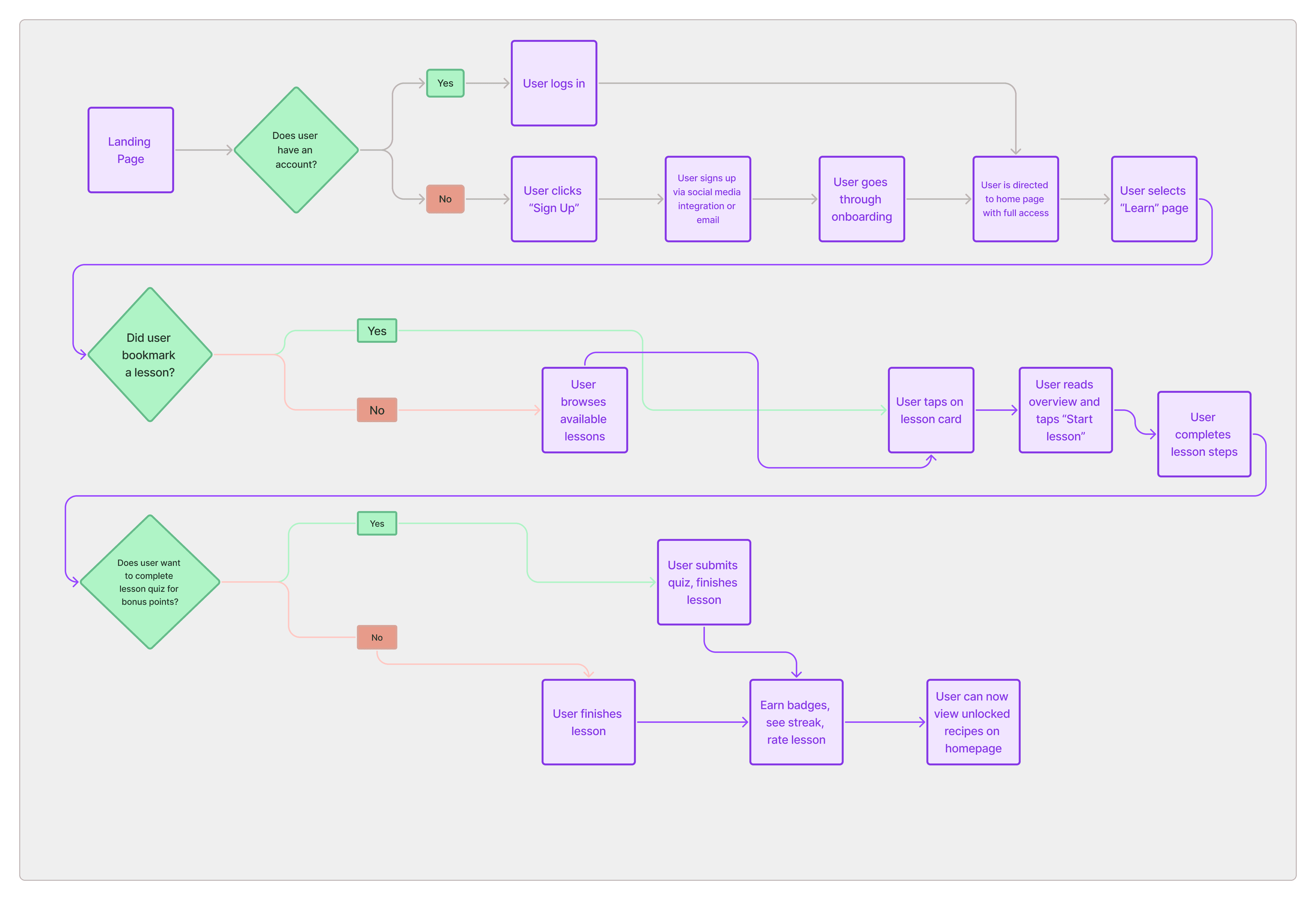
To develop the user flow for Simmer & Stir, I focused on two key tasks: setting up an account and preferences, and completing a lesson. I merged these tasks into a cohesive user flow using insights from user research and affinity mapping to ensure it was intuitive and met user needs.
Main Tasks
Main Tasks
To develop the user flow for Simmer & Stir, I focused on two key tasks: setting up an account and preferences, and completing a lesson. I merged these tasks into a cohesive user flow using insights from user research and affinity mapping to ensure it was intuitive and met user needs.
To develop the user flow for Simmer & Stir, I focused on two key tasks: setting up an account and preferences, and completing a lesson. I merged these tasks into a cohesive user flow using insights from user research and affinity mapping to ensure it was intuitive and met user needs.
CHALLENGE
CHALLENGE
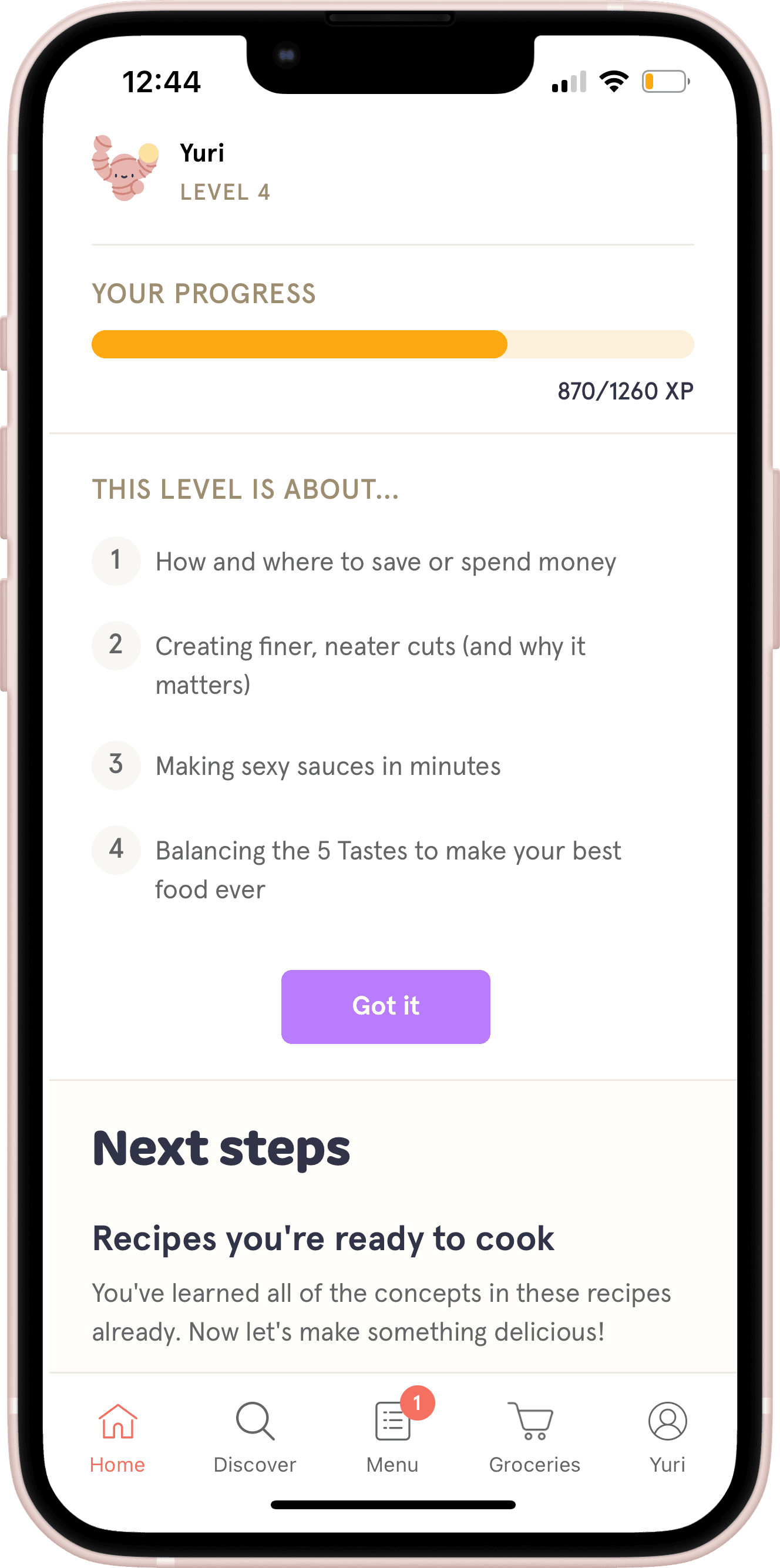
Discovering a competing app with a similar concept made me realize the challenge of standing out in a crowded market, prompting me to explore how to differentiate my own project. I decided to try out "Zest" to better understand how I can accomplish this.
Discovering a competing app with a similar concept made me realize the challenge of standing out in a crowded market, prompting me to explore how to differentiate my own project. I decided to try out "Zest" to better understand how I can accomplish this.
Discovering a competing app with a similar concept made me realize the challenge of standing out in a crowded market, prompting me to explore how to differentiate my own project. I decided to try out "Zest" to better understand how I can accomplish this.




Feature Comparison
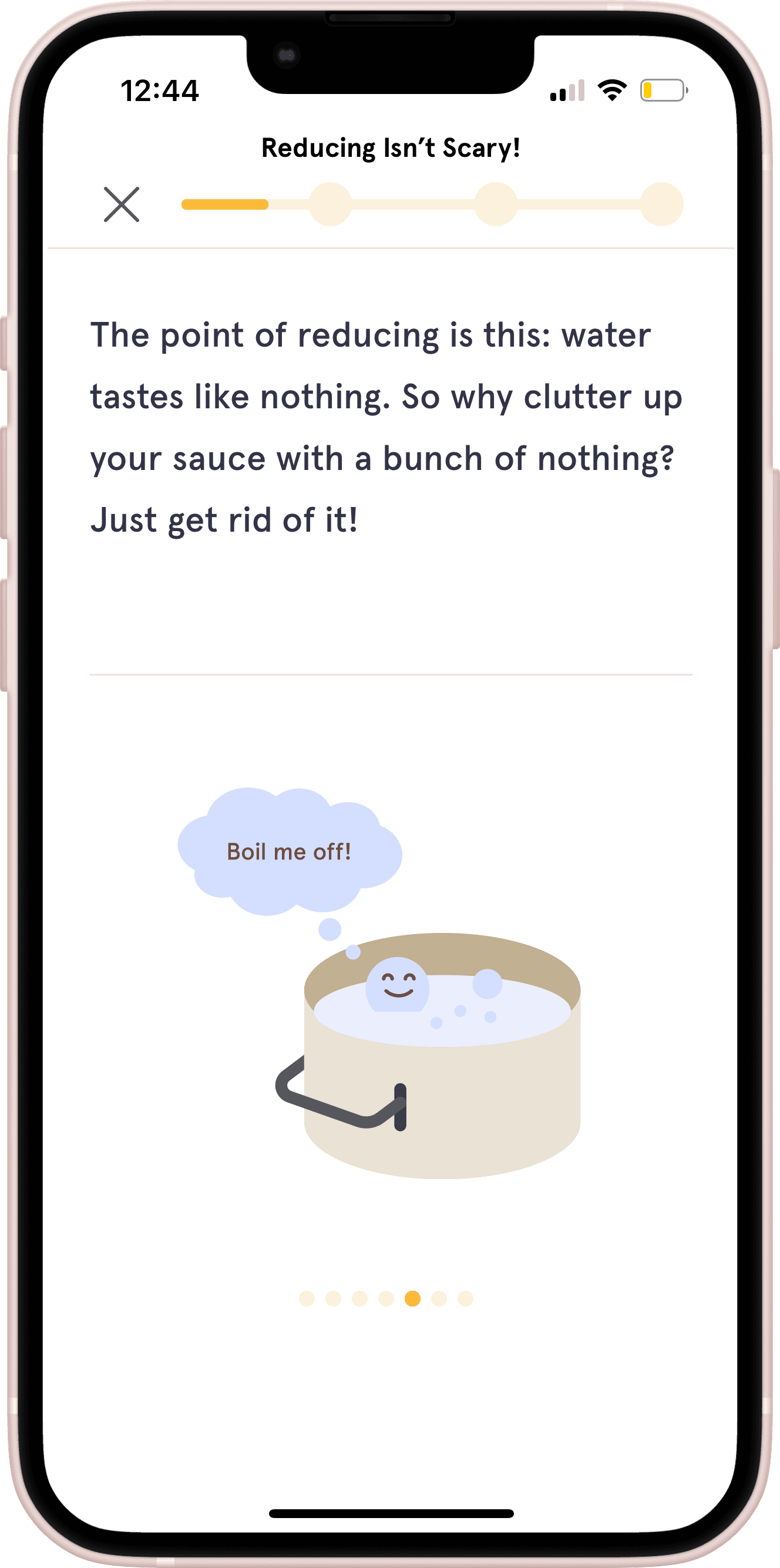
I took this opportunity to analyze Zest's strengths and areas for improvement to inform my design decisions.
Users appreciate Zest’s gamified cooking approach and its integration of food science with recipes.
They value the engaging, bite-sized lessons and the mascot reminiscent of Duolingo's.
However, the skill assessment has received mixed feedback due to overly specific questions and misalignment with users' actual skill levels.
Additionally, Zest offers limited personalization features, like tailored search options or allergy listings.
In contrast, Simmer & Stir focuses on recipe discovery with gamified learning.
It is designed to allow users to filter by skill level while still accessing the entire library of lessons.
This approach supports user discovery and retention by enabling users to revisit basics or tackle more advanced content as desired, with recommended courses tailored to their skill level.
Additionally, considering that users find Zest’s cost prohibitive, a freemium model supported by ads could be an effective strategy to encourage wider adoption and conversion.
Feature Comparison
Feature Comparison
I took this opportunity to analyze Zest's strengths and areas for improvement to inform my design decisions.
Users appreciate Zest’s gamified cooking approach and its integration of food science with recipes.
They value the engaging, bite-sized lessons and the mascot reminiscent of Duolingo's.
However, the skill assessment has received mixed feedback due to overly specific questions and misalignment with users' actual skill levels.
Additionally, Zest offers limited personalization features, like tailored search options or allergy listings.
In contrast, Simmer & Stir focuses on recipe discovery with gamified learning.
It is designed to allow users to filter by skill level while still accessing the entire library of lessons.
This approach supports user discovery and retention by enabling users to revisit basics or tackle more advanced content as desired, with recommended courses tailored to their skill level.
Additionally, considering that users find Zest’s cost prohibitive, a freemium model supported by ads could be an effective strategy to encourage wider adoption and conversion.
WIREFRAMES
















Wireframing Process
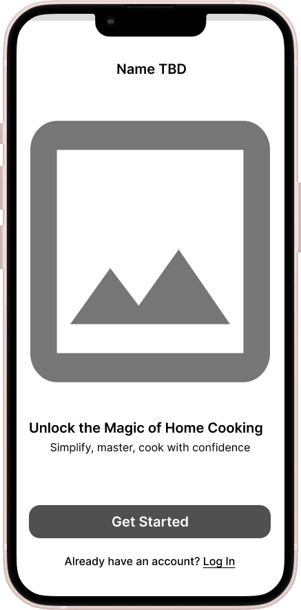
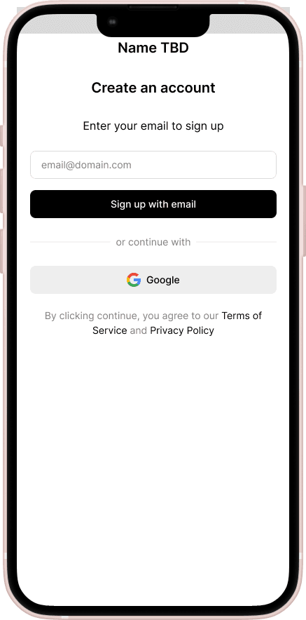
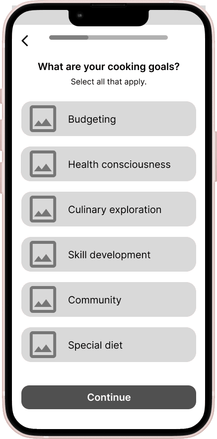
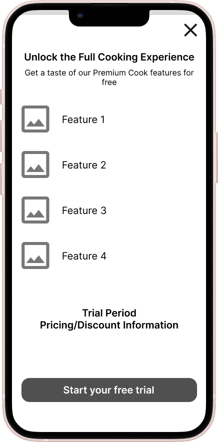
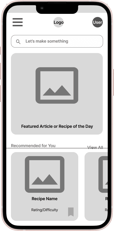
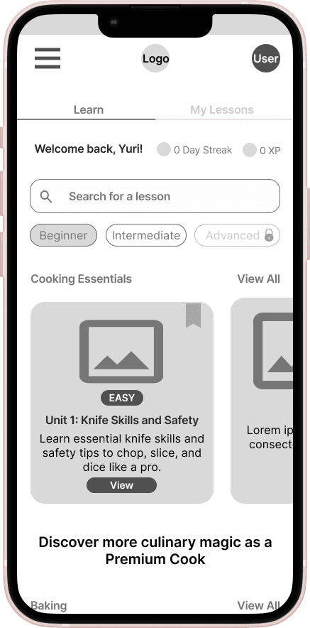
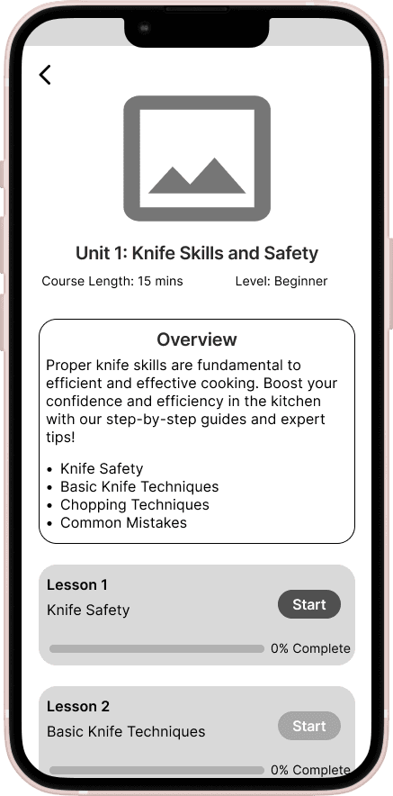
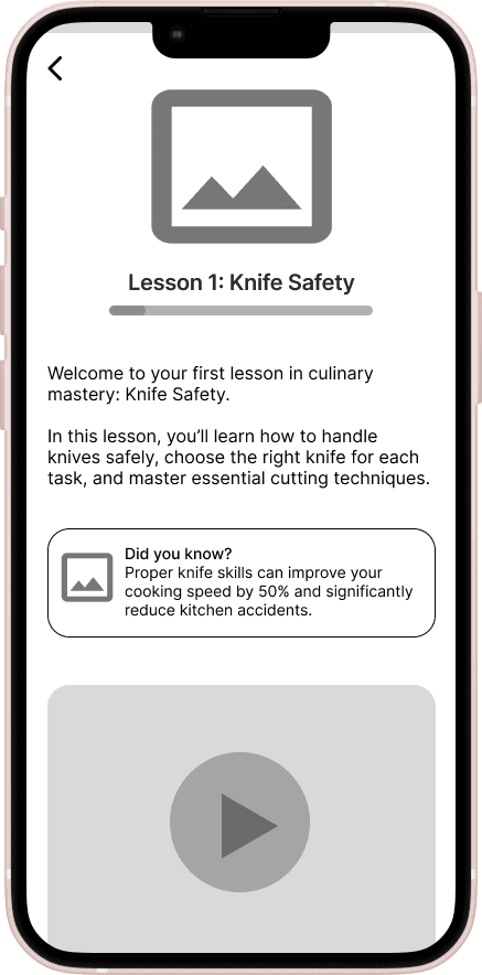
I designed Simmer & Stir’s onboarding and lesson screens with clarity and simplicity in mind. Drawing inspiration from existing cooking apps, I crafted a homepage that encourages users to scroll and explore, while the lesson screens clearly outline what users can expect. Using low-fidelity wireframes, I mapped out intuitive layouts and navigation to ensure a smooth start with the mobile site and easy navigation.
This provided a solid foundation to build on. I then created a minimal prototype and sought feedback from my mentor and other designers.
Their insights were extremely helpful. For instance, fellow designers noted that the "View" button and "Easy" tag on the learning page (second row, second frame) both resembled buttons, which could cause user confusion. To address this, they suggested ensuring the tag looks distinct from the button. I also learned the importance of helping developers understand and differentiate between the functions of various elements. This wireframing process taught me how to better meet user expectations and create a common language when presenting my wireframes to developers.
Wireframing Process
Wireframing Process
I designed Simmer & Stir’s onboarding and lesson screens with clarity and simplicity in mind. Drawing inspiration from existing cooking apps, I crafted a homepage that encourages users to scroll and explore, while the lesson screens clearly outline what users can expect. Using low-fidelity wireframes, I mapped out intuitive layouts and navigation to ensure a smooth start with the mobile site and easy navigation.
This provided a solid foundation to build on. I then created a minimal prototype and sought feedback from my mentor and other designers.
Their insights were extremely helpful. For instance, fellow designers noted that the "View" button and "Easy" tag on the learning page (second row, second frame) both resembled buttons, which could cause user confusion. To address this, they suggested ensuring the tag looks distinct from the button. I also learned the importance of helping developers understand and differentiate between the functions of various elements. This wireframing process taught me how to better meet user expectations and create a common language when presenting my wireframes to developers.
VISUAL DESIGN
VISUAL DESIGN


Visuals
Visuals
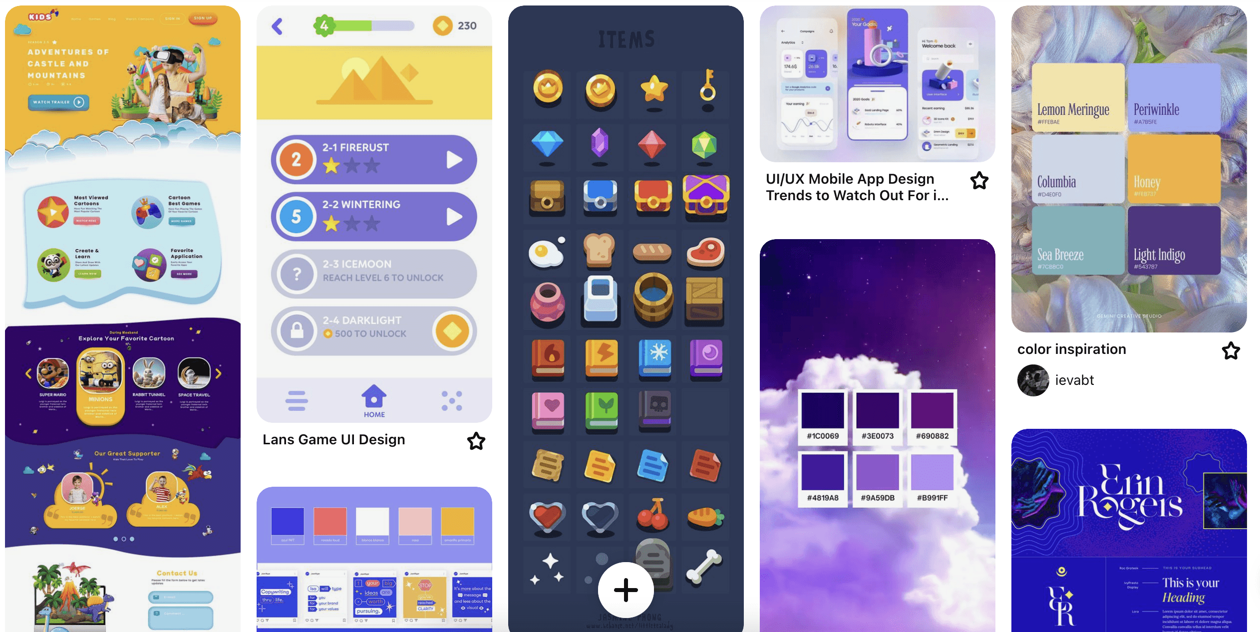
In developing Simmer & Stir’s branding, I drew inspiration from Pinterest, gathering color schemes and UI examples to shape the visual identity. The core ethos behind Simmer & Stir is the concept of cooking as magic. This guiding idea led me to create a color palette designed to evoke awe and curiosity. I also designed a logo that reflects the visual identity and ethos of Simmer & Stir. The branding incorporates animated elements and enchanting imagery to emphasize the wonder of cooking as an alchemical art, while ensuring the functionality and simplicity of the site remain intact.
I developed my high-fidelity designs by refining the initial wireframes, integrating the magic-inspired color palette and clean, rounded typography. I made sure that all design elements, including icons and graphic assets, were cohesive and visually attractive, aligning with the site's user experience objectives.
Visuals
In developing Simmer & Stir’s branding, I drew inspiration from Pinterest, gathering color schemes and UI examples to shape the visual identity. The core ethos behind Simmer & Stir is the concept of cooking as magic. This guiding idea led me to create a color palette designed to evoke awe and curiosity. I also designed a logo that reflects the visual identity and ethos of Simmer & Stir. The branding incorporates animated elements and enchanting imagery to emphasize the wonder of cooking as an alchemical art, while ensuring the functionality and simplicity of the site remain intact.
I developed my high-fidelity designs by refining the initial wireframes, integrating the magic-inspired color palette and clean, rounded typography. I made sure that all design elements, including icons and graphic assets, were cohesive and visually attractive, aligning with the site's user experience objectives.
USABILITY TESTING
USABILITY TESTING
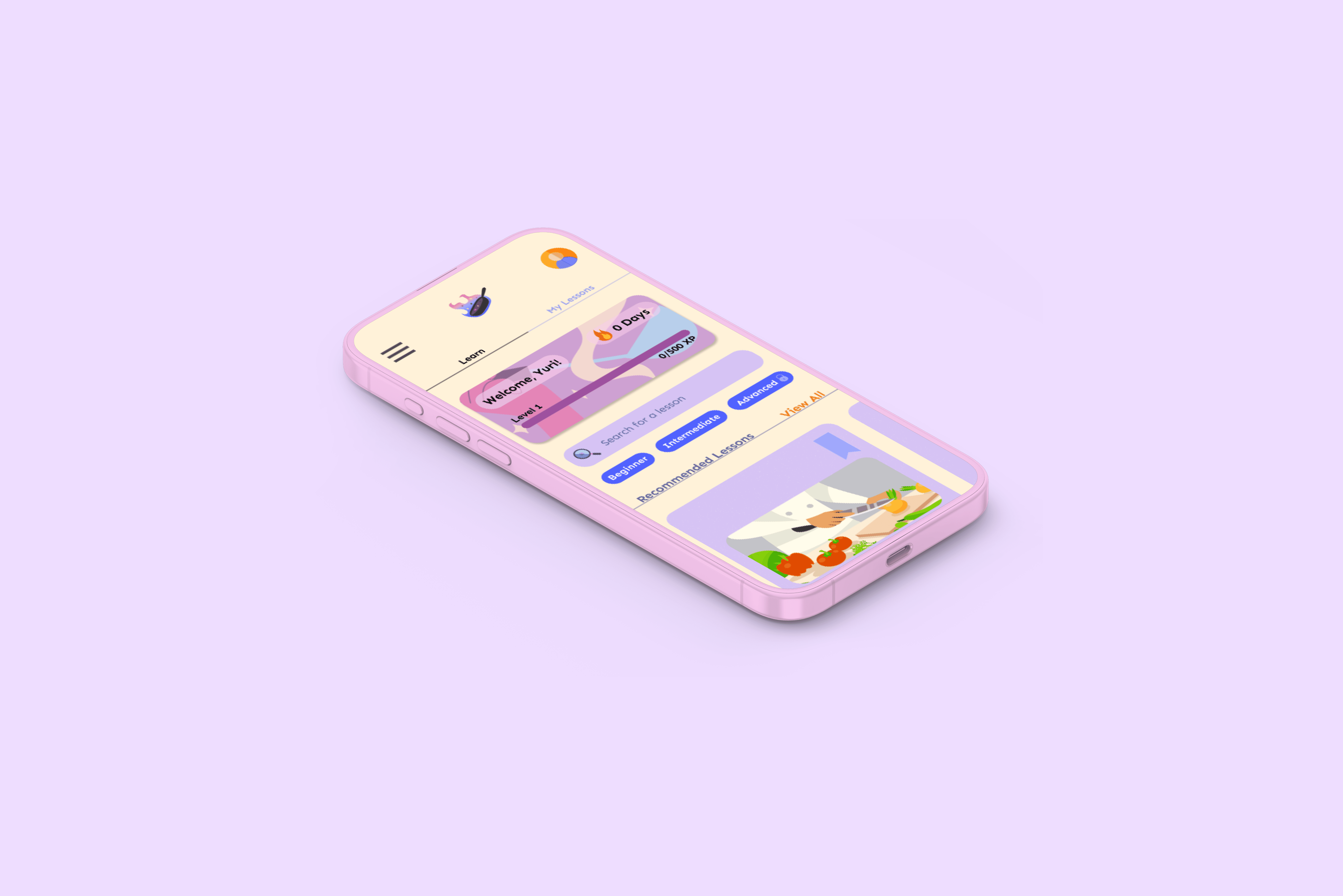


Time to Investigate
Time to Investigate
I set up a Figma prototype and conducted usability testing with 9 users; 4 of which were moderated, and 5 unmoderated using Maze.
Some patterns emerged:
I set up a Figma prototype and conducted usability testing with 9 users; 4 of which were moderated, and 5 unmoderated using Maze.
Some patterns emerged:
Time to Investigate
I set up a Figma prototype and conducted usability testing with 9 users; 4 of which were moderated, and 5 unmoderated using Maze.
Some patterns emerged:

Users wanted to see fewer text and more images, particularly in the lesson screens. Some users recommended increasing font size overall.
Users wanted to see fewer text and more images, particularly in the lesson screens. Some users recommended increasing font size overall.
Users wanted to see fewer text and more images, particularly in the lesson screens. Some users recommended increasing font size overall.

Majority of users mentioned liking the the visual design and intuitive layouts, without prompting.
Majority of users mentioned liking the the visual design and intuitive layouts, without prompting.
Majority of users mentioned liking the the visual design and intuitive layouts, without prompting.

Majority of users had trouble navigating to the learning section of the site.
Majority of users had trouble navigating to the learning section of the site.
Majority of users had trouble navigating to the learning section of the site.

Users appreciated the lesson's conciseness and clarity. Users expressed that earning XP points and creating a streak at the end of a lesson would encourage continued use.
Users appreciated the lesson's conciseness and clarity. Users expressed that earning XP points and creating a streak at the end of a lesson would encourage continued use.
Users appreciated the lesson's conciseness and clarity. Users expressed that earning XP points and creating a streak at the end of a lesson would encourage continued use.
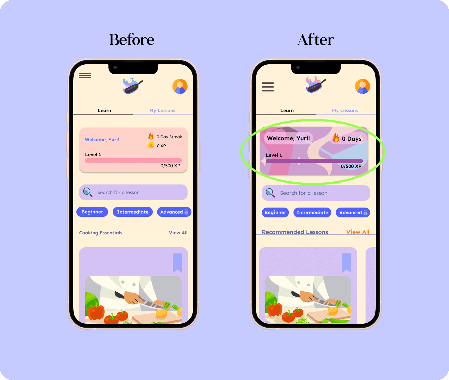


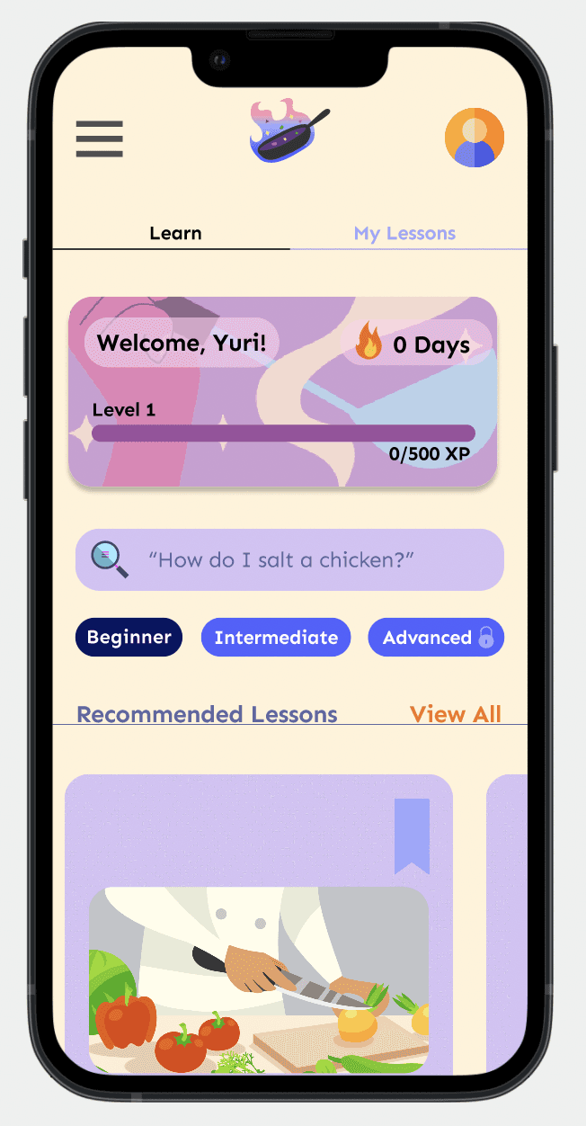
I noticed users were mistakenly clicking the box containing XP points & streak because it resembled other clickable cards.
To resolve this confusion and enhance the UI, I chose a unique, non-clickable image that fits the theme and won't be mistaken for an interactive element.
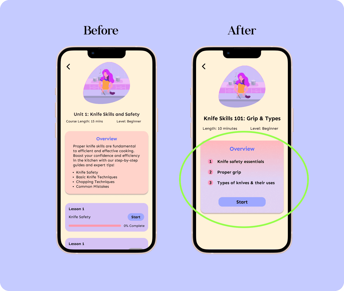

A few users were confused by the lesson flow and suggested that each lesson should be standalone rather than divided into multiple parts per unit.
Additionally, feedback indicated that less text is preferable. To address this, I redesigned certain pages to be as concise as possible, focusing on key elements and using visual cues to minimize text and reduce cognitive load.
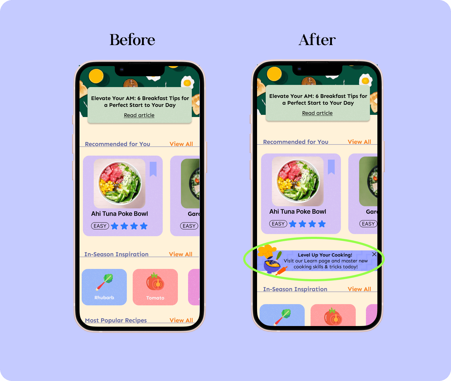

After onboarding, users often forgot about the learning page on Simmer & Stir because the main page, designed for scrolling through recipes and articles, drew their focus.
While I aimed to cater to both learners and those only seeking recipe inspiration, the learning page became difficult to find. To fix this, I added a banner with a direct link to the learning page. Users not interested in this feature can click the X to opt out of the reminder.
I noticed users were mistakenly clicking the box containing XP points & streak because it resembled other clickable cards.
To resolve this confusion and enhance the UI, I chose a unique, non-clickable image that fits the theme and won't be mistaken for an interactive element.
I noticed users were mistakenly clicking the box containing XP points & streak because it resembled other clickable cards.
To resolve this confusion and enhance the UI, I chose a unique, non-clickable image that fits the theme and won't be mistaken for an interactive element.
A few users were confused by the lesson flow and suggested that each lesson should be standalone rather than divided into multiple parts per unit.
Additionally, feedback indicated that less text is preferable. To address this, I redesigned certain pages to be as concise as possible, focusing on key elements and using visual cues to minimize text and reduce cognitive load.
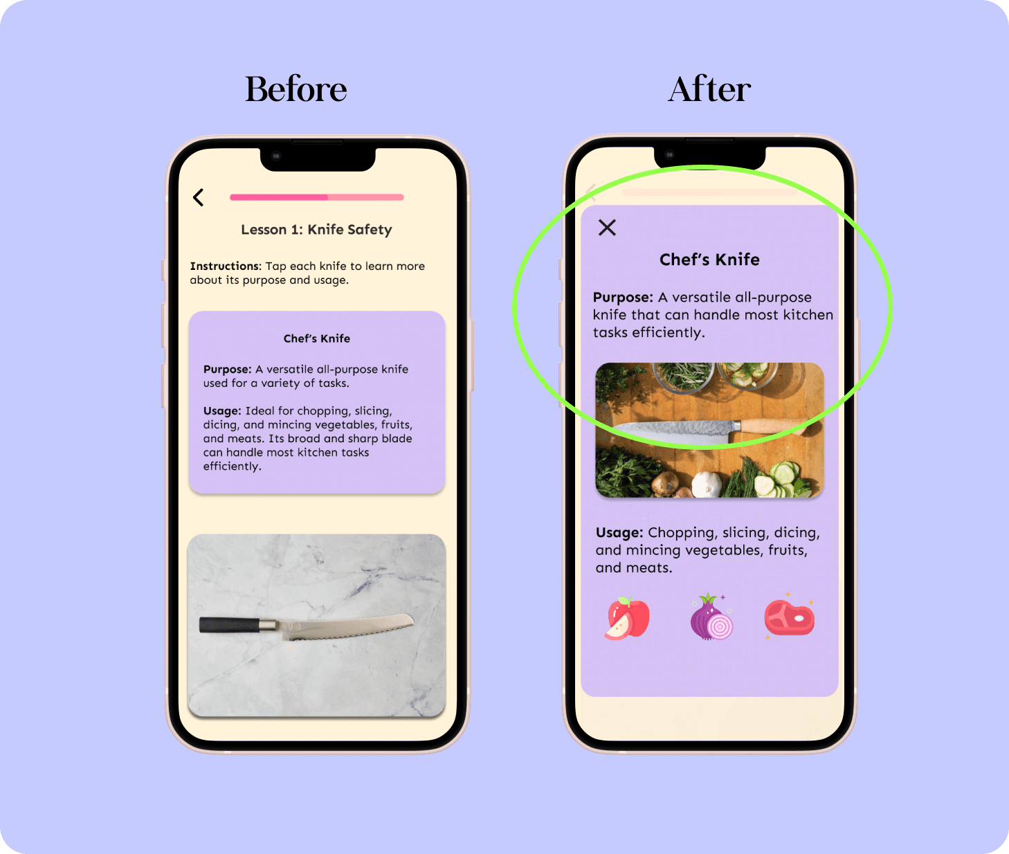

Users requested that text take up most of the screen, and some suggested adding more images to enhance learning. Initially, learners could tap an image of a knife, which would flip the card to reveal information.
In my redesign, I used overlays so that text and images occupy the entire screen, allowing the information to remain visible alongside the knife image. This approach enhances learning retention and creates a more engaging lesson, making users more likely to return for future lessons.


After onboarding, users often forgot about the learning page on Simmer & Stir because the main page, designed for scrolling through recipes and articles, drew their focus.
While I aimed to cater to both learners and those only seeking recipe inspiration, the learning page became difficult to find. To fix this, I added a banner with a direct link to the learning page. Users not interested in this feature can click the X to opt out of the reminder.
Users requested that text take up most of the screen, and some suggested adding more images to enhance learning. Initially, learners could tap an image of a knife, which would flip the card to reveal information.
In my redesign, I used overlays so that text and images occupy the entire screen, allowing the information to remain visible alongside the knife image. This approach enhances learning retention and creates a more engaging lesson, making users more likely to return for future lessons.
In Conclusion
In Conclusion
There's so much more I would have loved to build out if I had the time. Users were thrilled with the product, particularly beginner cooks who appreciated the gamified learning approach. They expressed eagerness for more and indicated they would rely on the app for recipe inspiration and learning.
The app effectively addresses users' needs: Jessica can save money on takeout and gain confidence in cooking despite her busy schedule, while Liz receives fresh recipe ideas tailored to her dietary preferences.
Next, I plan to refine features, focusing on how they integrate both individually and collectively. I envision designing recipe pages linked to relevant lessons and providing substitution options. I also want to enhance the gamification aspects with challenges and badges for unlocking exclusive content.
Working on Simmer & Stir was both exciting and rewarding, allowing me to tackle a personal challenge in cooking education and connect with my passion for food. As my first end-to-end UX/UI project for a mobile website, it provided valuable challenges and learning opportunities.
In Conclusion
There's so much more I would have loved to build out if I had the time. Users were thrilled with the product, particularly beginner cooks who appreciated the gamified learning approach. They expressed eagerness for more and indicated they would rely on the app for recipe inspiration and learning.
The app effectively addresses users' needs: Jessica can save money on takeout and gain confidence in cooking despite her busy schedule, while Liz receives fresh recipe ideas tailored to her dietary preferences.
Next, I plan to refine features, focusing on how they integrate both individually and collectively. I envision designing recipe pages linked to relevant lessons and providing substitution options. I also want to enhance the gamification aspects with challenges and badges for unlocking exclusive content.
Working on Simmer & Stir was both exciting and rewarding, allowing me to tackle a personal challenge in cooking education and connect with my passion for food. As my first end-to-end UX/UI project for a mobile website, it provided valuable challenges and learning opportunities.